Overview
Let's Dance was my final project for Ironhack in Barcelona. The most important goal of this project was to build in two weeks, a digital product based in our vision, research, findings and the UX / UI process we had learned throughout the entire program. The process should respect and include all steps of the design thinking process and the tools we have learned during the bootcamp .
UX Research
" Are you wishing to try a new type of dance and you don't know how to start?"
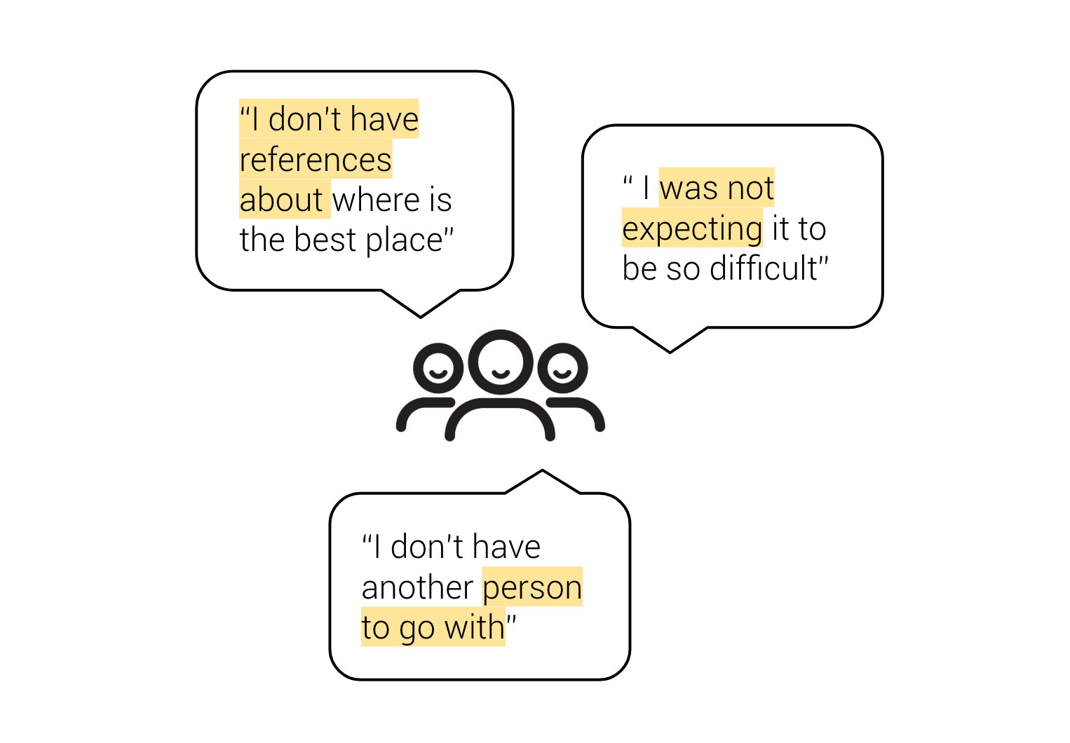
This was my first assumption: It could be very enthusiastic learning a new type of dance, but without the right references you feel frustrated. I was confronted with that problem, after moving abroad. Similar to myself, I wanted to discover what motivates others dance lovers (not professionals), while looking for dance activities. I tried to understand their habits, behaviours, and their pain points towards dance activities.
Findings
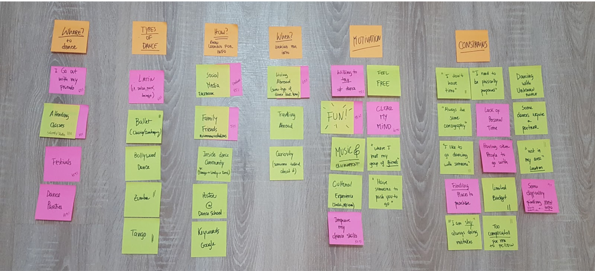
I interviewed 5 people based on my target audience in order to obtain qualitative information. Around 50 people answered my online survey, that is qualified for being more quantitative info. To analyse all data, I created the affinity diagram (image below). Based on that, it was easier for me to draw a pattern, see all the data relations and later on, I defined 3 main insights:
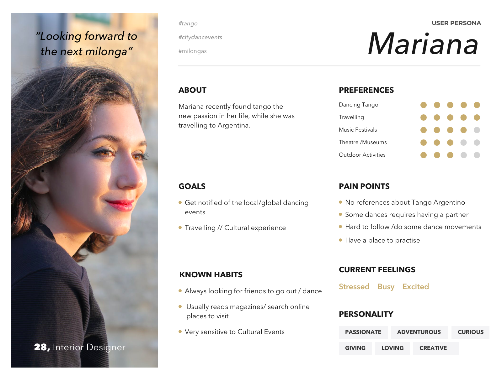
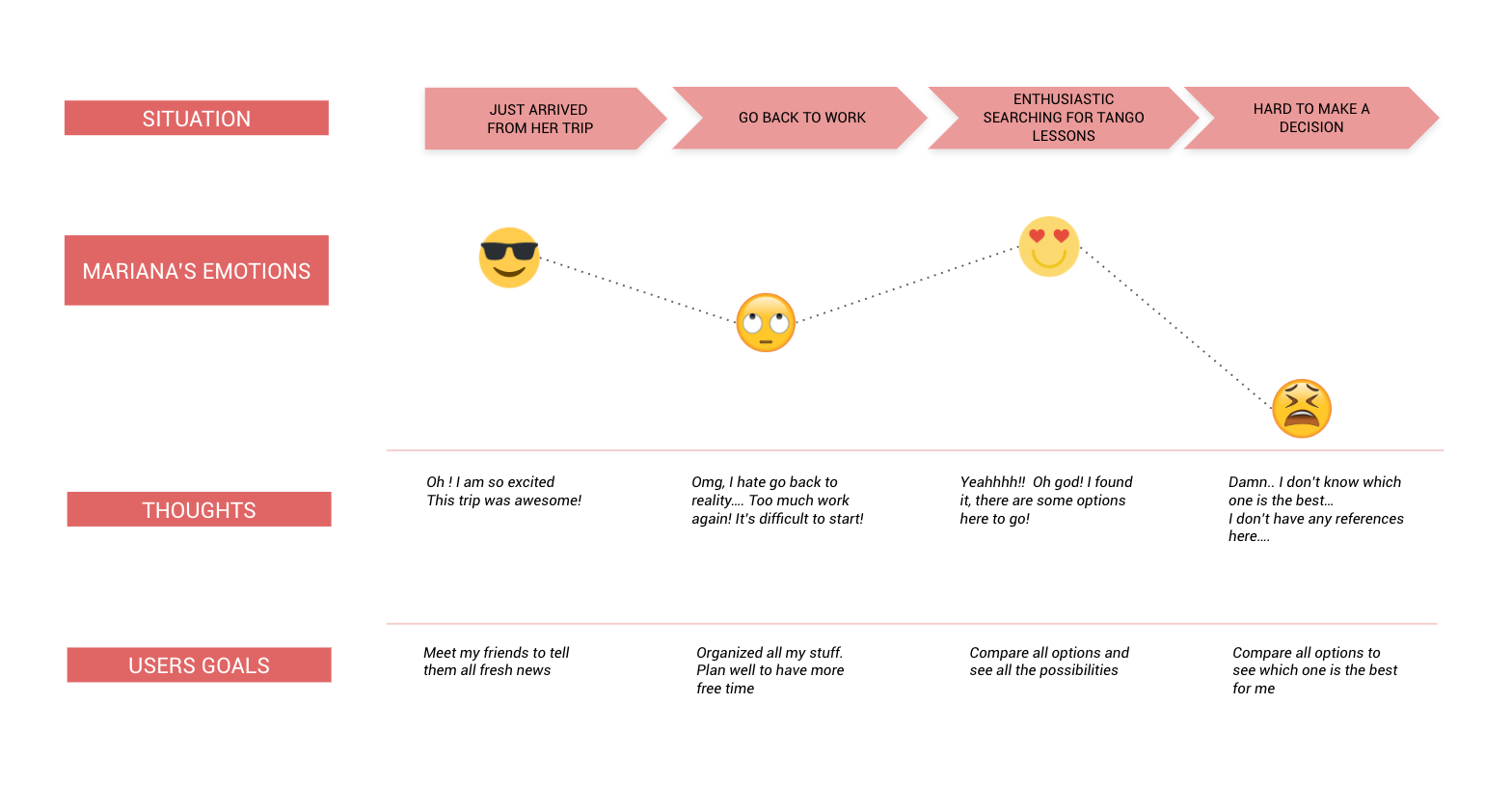
User Persona & User Journey
These main insights, emerging from the research led me to define my user persona: Mariana. To better identify my user’s pain points and opportunities for improvement, I created one moment of Mariana's day with the following user Journey Map.
Problem Statement
Dance Lovers who have the curiosity/motivation to attend dance activities, need to find a way to get that information because they don’t know the right people to ask, or they are new in town.
Small Studios need to find a way to have more visibility because they usually work on mouth to mouth information and they have students inside their friends’ network.
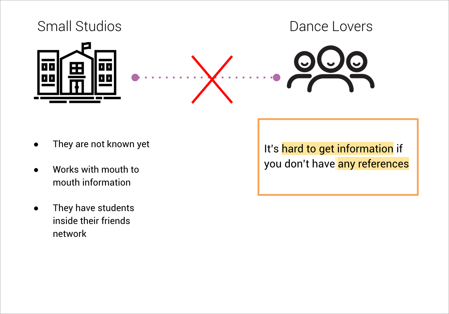
My solution bridges this gap between small studios and dance lovers!
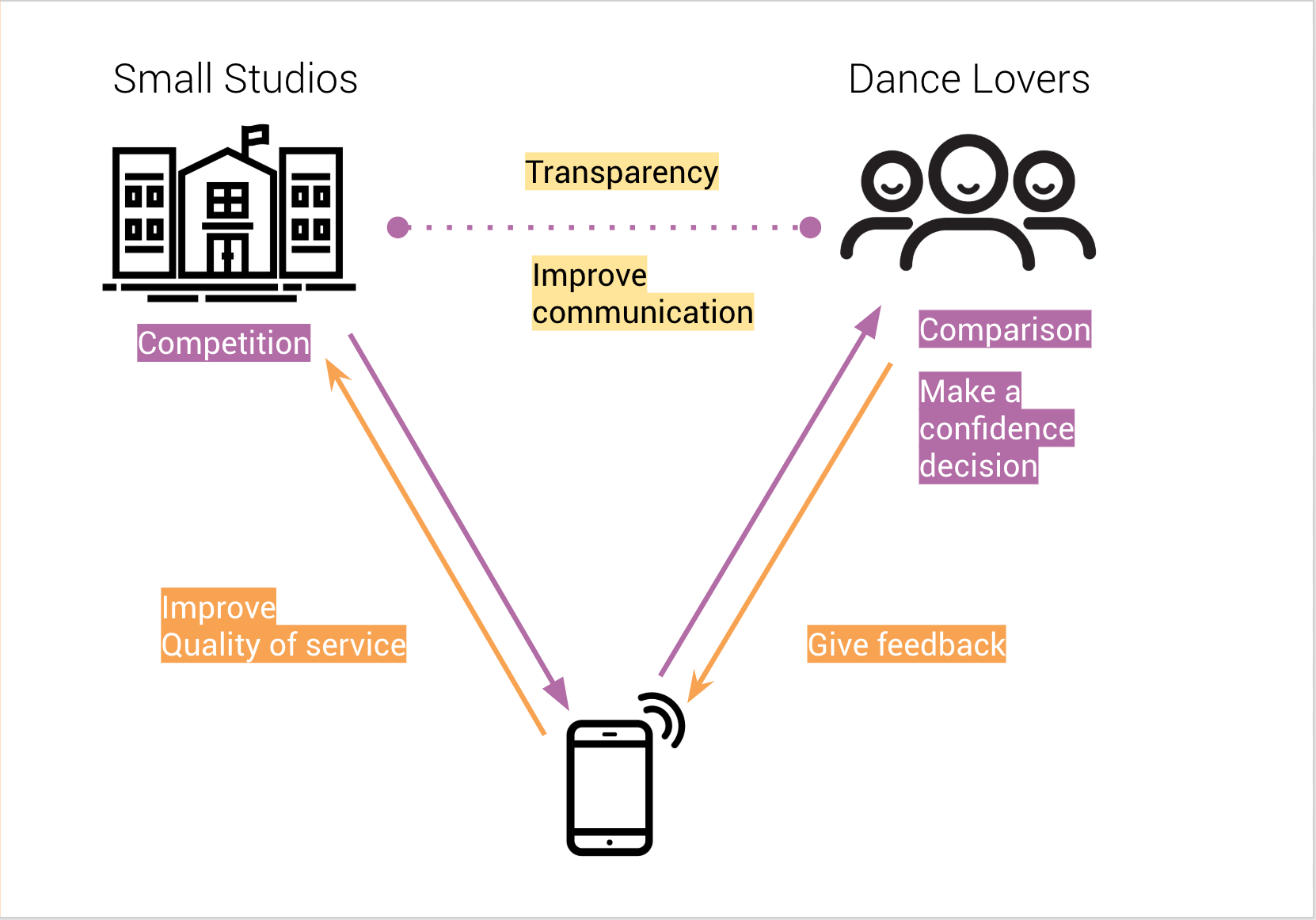
I figured out from my competitive analysis, that small studios usually work independently. If they were together in the same platform, they will compete amongst each other and consequently, the user will receive more and much better information to analyse and compare them. On the other hand, users could also improve the quality of services for dance studios by giving them their feedback. From my point of view, it’s very important to improve this channel of communication, providing a transparent and local experience!
To better analyse this problem and possible solutions, I created the Lean Ux Canvas (image below). I can say it was my guideline throughout the project.
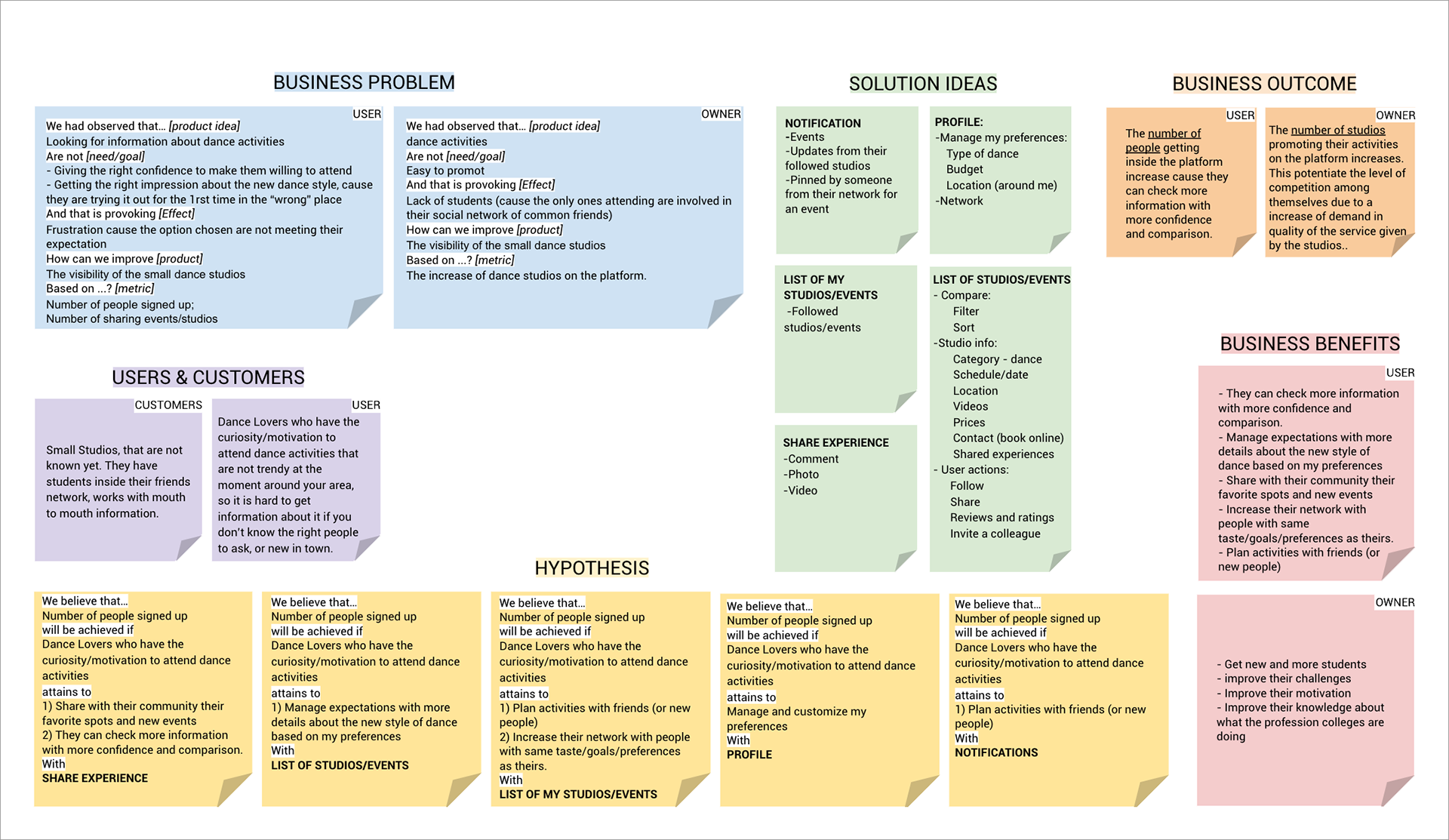
Lean UX Canvas
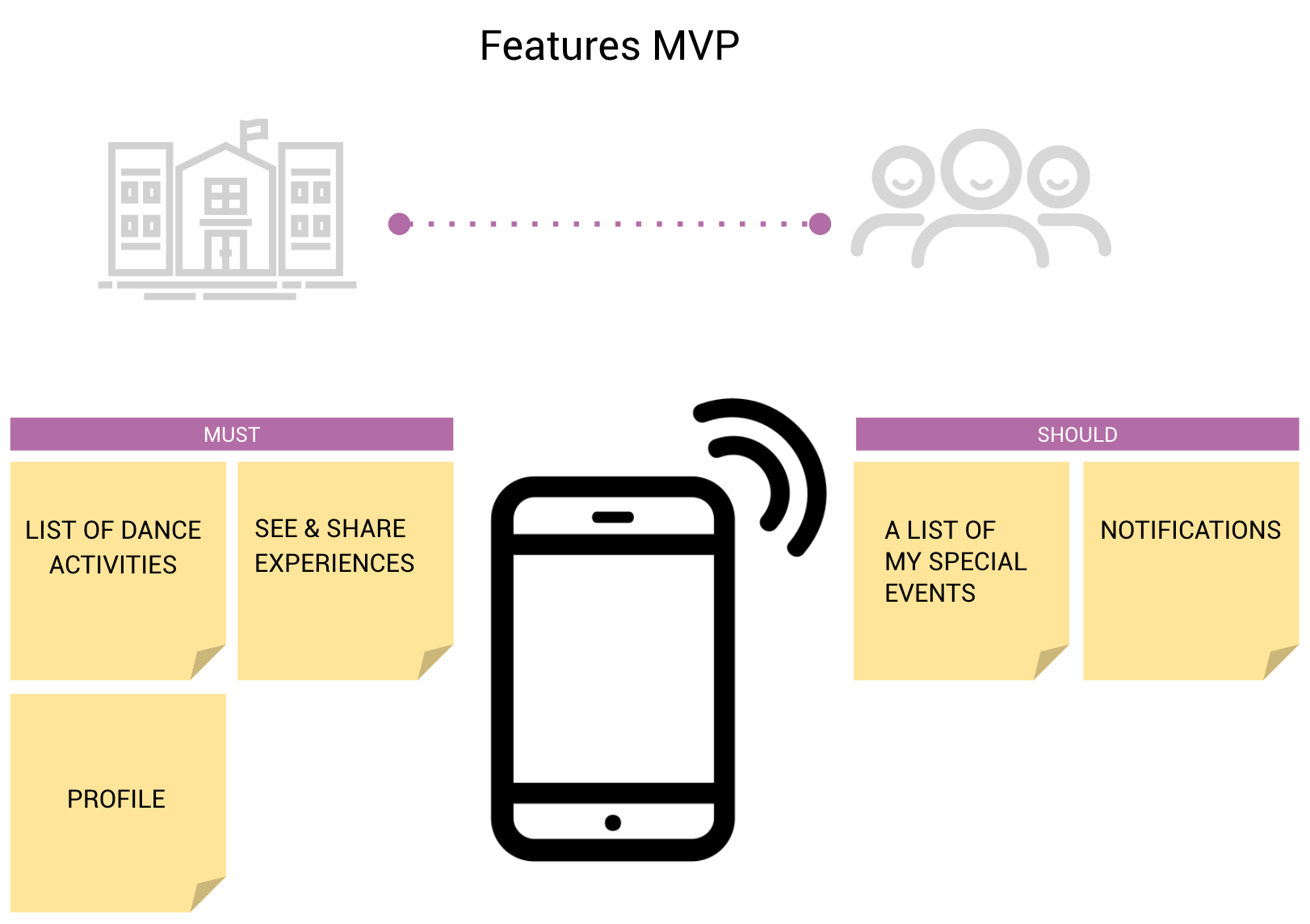
MVP (Minimum Viable Product)
Using MoSCoW method, it was useful to categorize the importance of the features with Must, Should, Could and Won’t.
User Testing
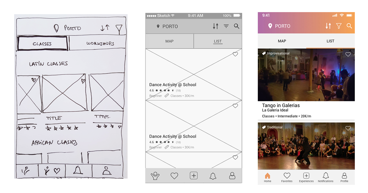
I started to materialize all these ideas by sketching with paper prototype and I tried “test soon to fail faster”. I’ve learnt that it’s better to start testing a small flow or just a detail than waiting for the complete prototype. During the process – from Low-Fi, Wireframes and Hi-Fi Prototype - the main changes were the screens:
1. Home Page:
Starting with small pictures in a carousel with categories, soon I realised it would be better for the user to have different types of visualisation: Not only being more delightful by having bigger pictures but also very useful to see all the activities in a map. Seeing thru categories wasn’t so important, so I moved it into filters. In addition, in the menu, I incorporated the feature “share experiences” represented with the “plus” icon. After some tests, I added the description “experiences" because it wasn’t so clear what the user was adding.
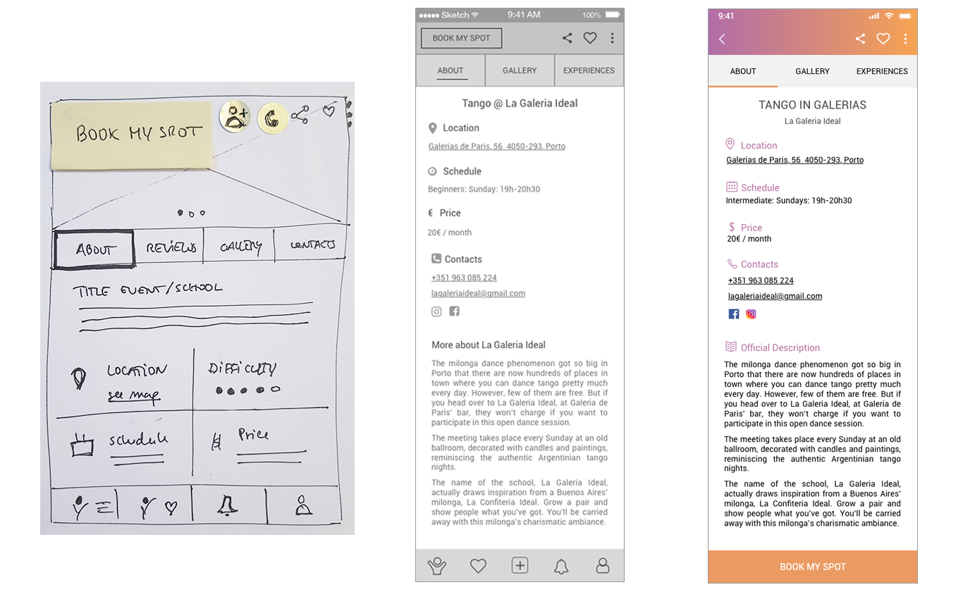
2. Activity Page:
What kind of information my users want to see beforehand? I moved the contacts to the front and the opposite happened for the description: it's only visible when you scroll. The “reviews" were replaced by “experiences" categorised with adjectives, instead of having a percentage/number. It's more personal and transparent approach. Also, I deleted the “invite a friend” action because almost all of my users said that it's enough to use “share” with (WhatsApp, Messenger or another social app) as a way to invite a friend. I changed the place of my CTA - "Book my Spot". Nevertheless, it has been always visible, even when you scroll.
High-fidelity Prototype
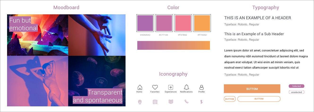
As the majority of my interviewees said: “When I dance, I just want to have fun”.
Having this in mind, I created my brand attributes, moodboard and style tile, where emotions will be transmitted with bright and vivid colours and the idea of movement using gradient. Icons with outlines will represent the transparency of communication.
The flow that I will show in this interactive prototype (video), simulates my user Persona (Mariana) in different moments:
1. Looking to attend Tango Classes, based in her preferences. Saves the one she likes
2. Received a notification/alert from school, she decided to book her spot
3. After attending the classes, she shares her experience
The Take Away
I’d like to test more, especially when you save an activity into your favorites. Based in user's feedback, isn't clear that you are saving the entire activity when clicking on the heart shape.
The user’s feedback is super valuable and the most challenging part for me is to grow in a sustainable way: adapt or change your prototype without losing the main purpose and the soul of your project. Always keeping in mind, that it’s always being focused in the user's needs and perspective, and not in your assumptions.