Overview
This project only lasted two weeks but I enjoyed being part of it. It was back in 2020, when corona hit, which meant we ran all design workshops remotely - I was working at Aginic (a Digital Consulting Firm). Our Client was TMR (Department of Transportation and Main Roads) for the Queensland Government in Australia.
The main goal was to build a tool to enable employees in TMR to measure and monitor their level of digital capabilities. Therefore, we could support the Qld government in taking strategic directions, knowing in advance which areas need improvement.
Design thinking Process
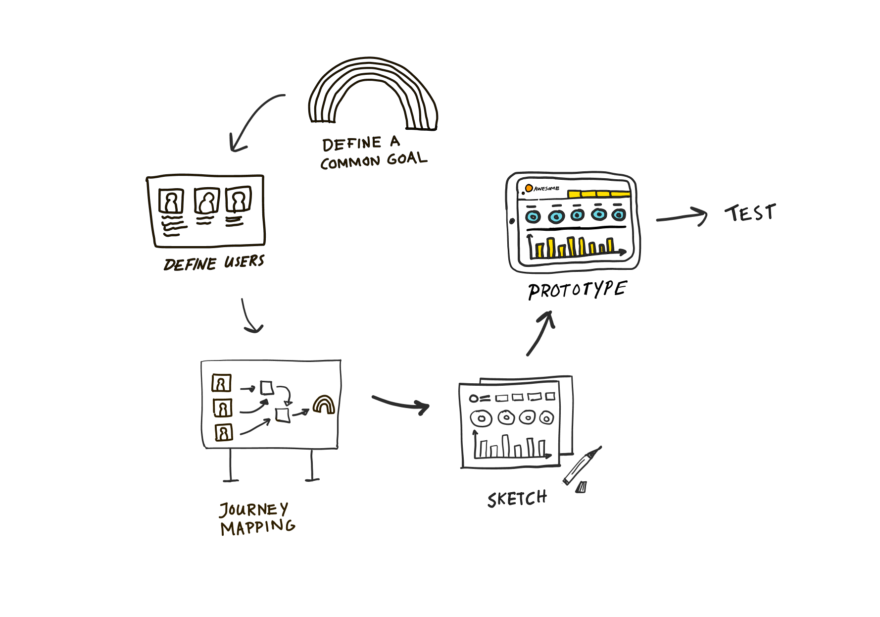
At Aginic, we worked as cross-functional teams which means Designers, Developers, Scrum masters, and Data Analysts used to work together since day one. In collaboration with our Client, all of us were involved in discovery workshops (for two intensive days), following the design thinking approach:
1. Empathize with users, listen, and empathize with their problems and needs;
2. Define the problem statement, to know where we wanted to focus on;
3. Ideate to come up with a lot of ideas;
4. Prototype a solution to the problem;
5. Test with end users, to gather as much feedback as possible.
For each phase, I will describe and illustrate in more detail what we've done.
Empathize & Define
Using the Miro board as a collaborative tool, we could easily talk about goals & needs, define the problem, and at the end, we created a journey map together. Four important moments of this tool were defined here:
1. Onboarding - Explain what users can get out of the tool;
2. Information gathering - Identify leadership level; TMR persona; E-mail address;
3. Assessment - In an engaged and gamified way, gather information from the TMR framework according to their selected leadership level
4. Report - See results, a summary of the profile, and what comes up next e.g. training resources.
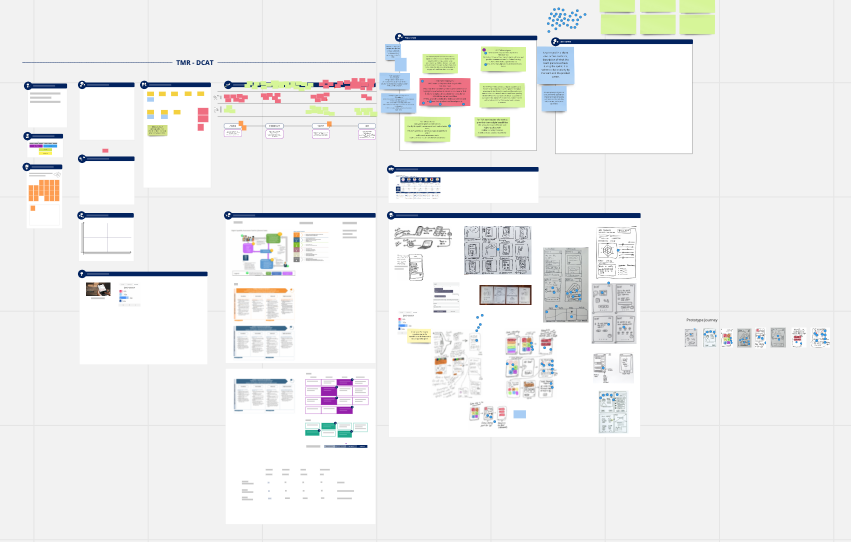
Overview of Miro board - Discovery workshop
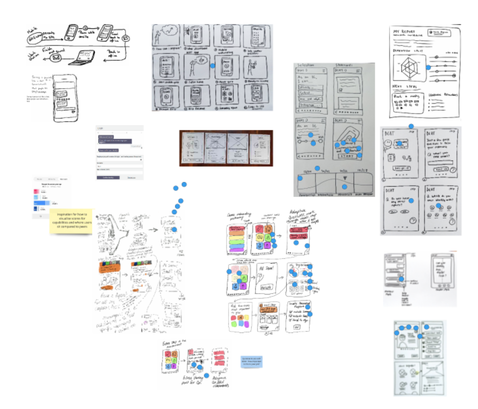
Ideate
To speed up the process, each of us had "homework - a drawing of the idea based on the moments previously defined. In the end, we voted (blue dots) for the solutions that could be feasible due to the time frame and budget.
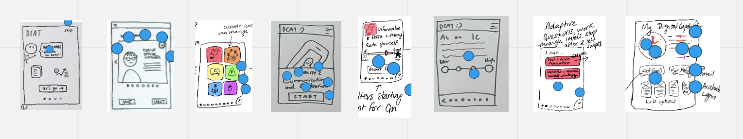
Prototype
Having the mains screens defined, it was much quicker to mock up that idea in Figma.
We started with the mobile-first approach and after testing it, we also created the desktop version.

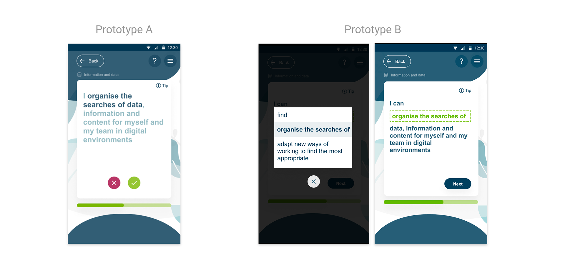
Test
We ran an A/B test for a few days with 1-1 interviews with 12 users.
The main difference between prototypes A and B is in the Assessment part, as shown in the images below.
7 out of 12 users preferred Prototype A. The reason is that in B, the modal window loses the context of the complete sentence and takes more time to complete the quiz.

A/B Testing Results - Summary
UI Mockups

The Take Away
The users were super engaged in this project and it made a big difference when they participated and were involved since the beginning of the process.
Communication, team support, and collaborative work were key to understanding what we wanted to achieve especially in a short time frame of work.