Overview
I worked as UX/UI designer at Real Serious Games (RSG), a tech company based in Brisbane, Australia.
RSG creates Virtual Reality (VR), Augmented reality (AR) and Extended Reality (XR) technologies which can be used for staff training in such different industries (engineering, construction and transportation sectors).
These technologies are super powerful and disrupts the traditional classroom room in the way of learning. Considering the XR training, the most immersive learning situation, the trainees will see and interact with a computer-generated 360 view which gives a complete realistic view of their surroundings. This ensures that the person that is learning is completely engaged, focused in the situation and, therefore will retain more information in a safer and experimental environment.
The challenge
The challenge for this project was about improving the telemetry system that tracks the VR learning experience for train drivers. Before I dive into it, I’ll briefly introduce this project answering the 5 key questions.
What is this system for?
The telemetry system allows learning skills to be evaluated and checked through virtual worlds, without the inherent risks involved in “hands-on” training.
Who are the users?
The main user are the facilitators that are going to teach train drivers.
Why the user needs this?
With this control system, the facilitator can visualise what the trainee is doing at real-time in a virtual world and track and evaluating trainee’s behaviours. This can guarantee better analysis in an evaluation process, provide more feedback and debrief with the trainees.
How the user is going to use it?
Telemetry system will be displayed in a tablet version which allows more mobility and flexibility for the facilitator, making it able for him to walk around the room. In order to start the VR experience, it is necessary to connect to a PC, VR headset and VR configuration (KAT-Omni-Directional treadmill or a Motion platform-MP).
Where the user will use it?
In a classroom equipped with PC, VR headset and VR configurations.
When the user will use it?
There are some limitations about VR and, the time spend on the virtual world is one of them (it is meant to be done on the 5 to 10-minute scale), which requires to divide all experience in small and multiple scenarios. Another aspect to consider is the need of swapping between physical and digital environment.

KAT-Omni-Directional treadmill (right side) or a Motion platform-MP (left side)
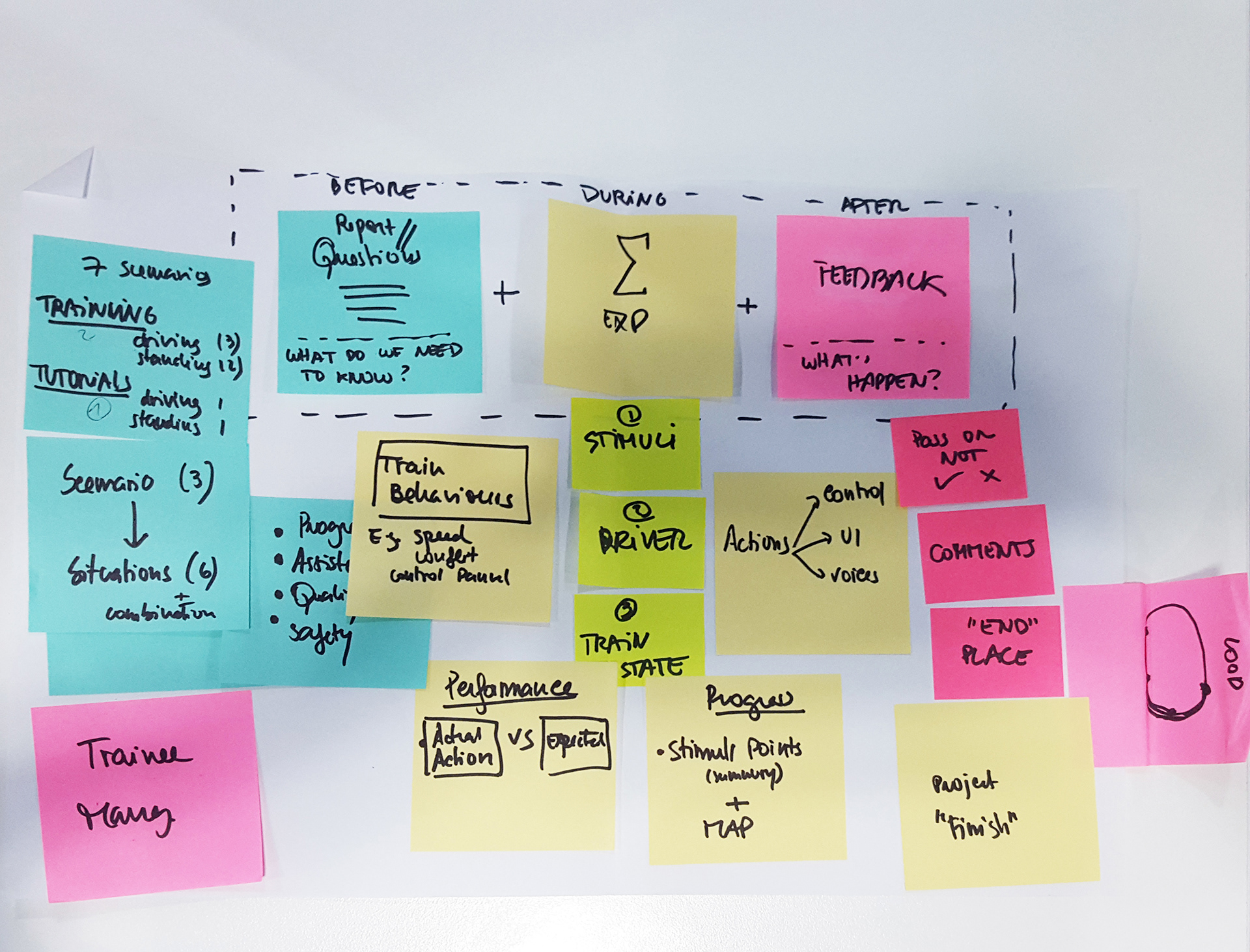
Ideation and mind mapping
This was not a project that started from scratch. Internally, some technology was already developed (e.g. the real-time journey of users’ movement) and other screens were conceptualised. Although it was necessary to give a step back, rethink, map all journey and the different scenarios to make sure most of the situations were covered.
Low-fidelity mock-ups and a lot of interactions were made and tested. A lot of great ideas and new features came out from those sessions. Although, for MVP we decided to spend our attention on the dashboard screen, since it is the most important one and where the facilitator will spend more time.

User Flow and Wireframes
Briefly, I will explain the user flow (just the main screens) that follows the "happy path" in an MVP version:
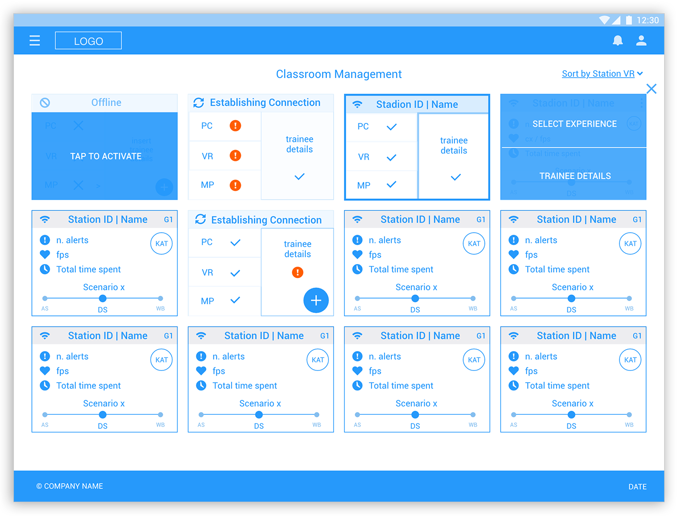
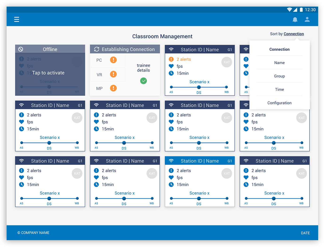
1. Classroom management
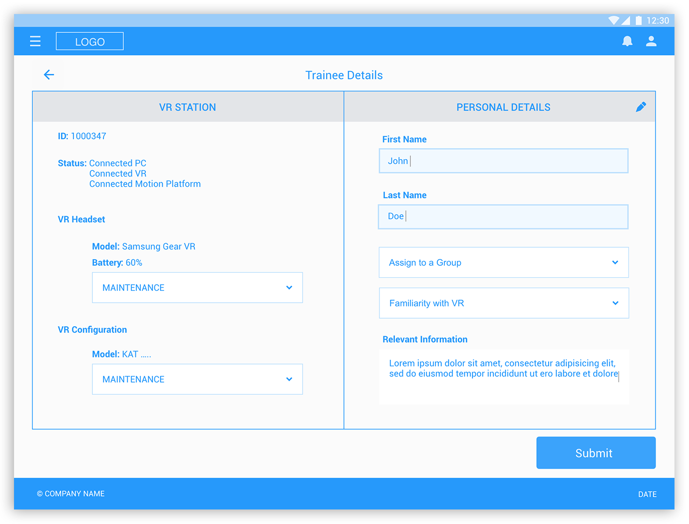
After logging in, a few cards will be displayed on the classroom management screen. Each card represents a student station that needs to be configured before starting the VR experience. To start, the user needs to tap to activate the card and establish the wi-fi connection. Then, the system will automatically recognise what station the trainee is allocated, depending on the type of configuration (e.g. if is standing - KAT or seated position - MP). The Trainee's details must be filled in before selecting the driving experience.
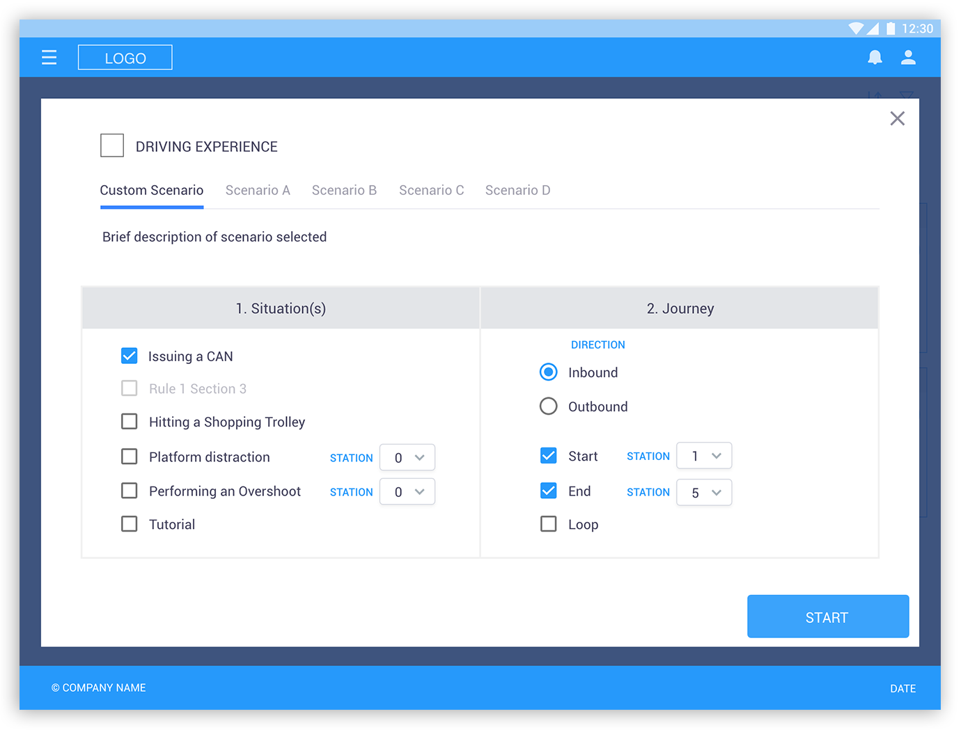
1.1 Selecting driving experience:
After all is set, the user will have the possibility to choose between pre-sets and custom scenarios, according to their specific needs. Every scenario has a different number of steps and it changes accordingly, depending on what has been selected and generating different combinations.
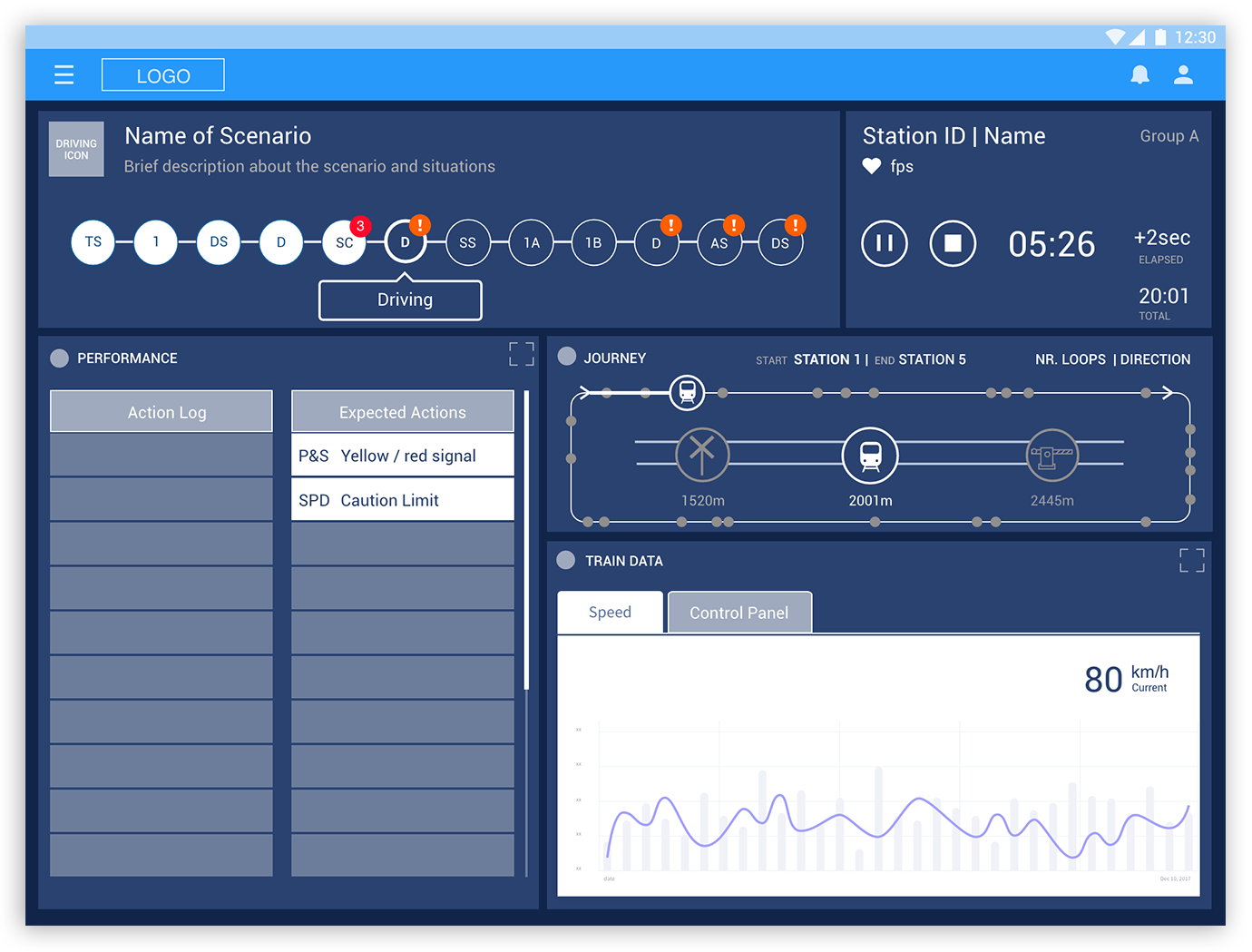
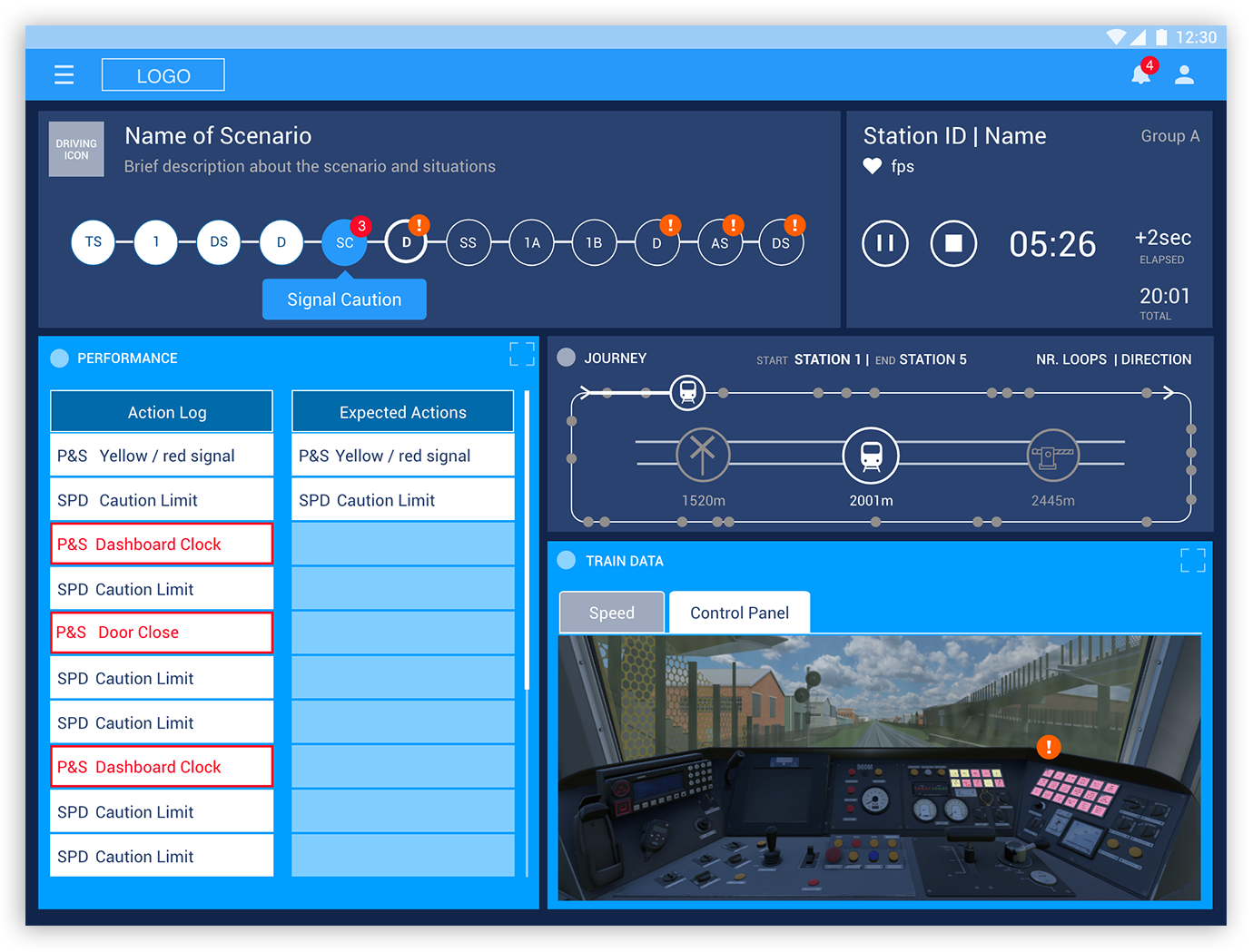
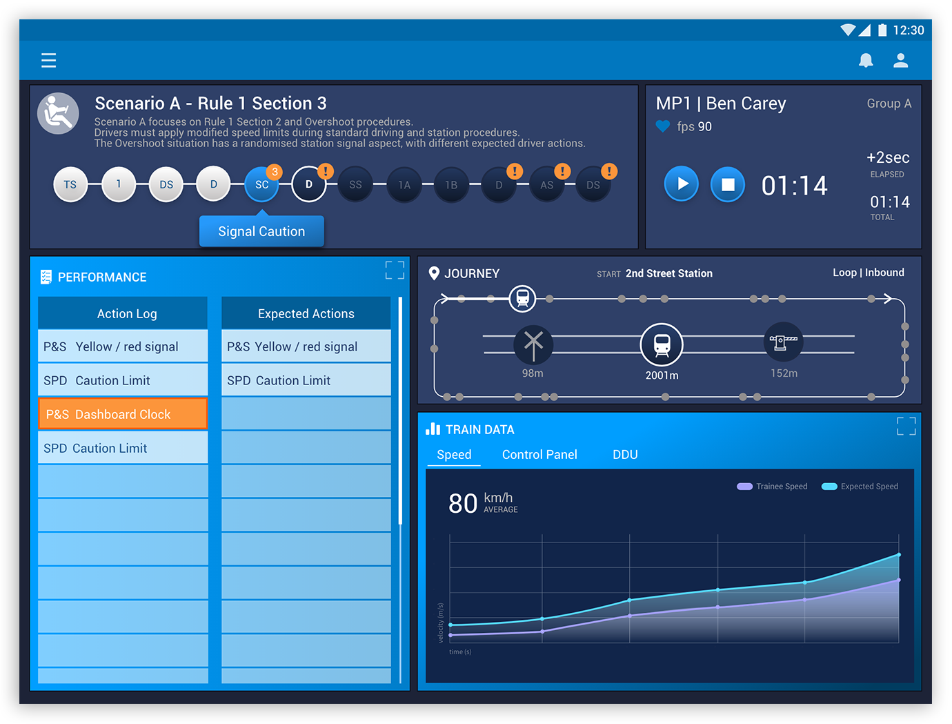
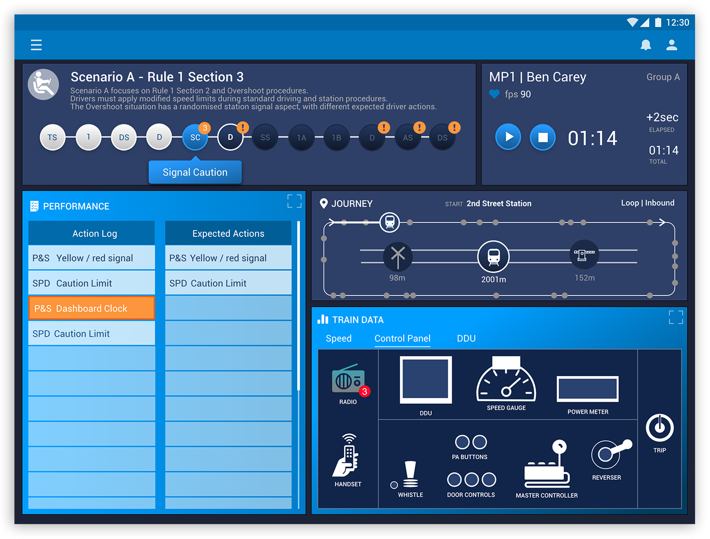
2. Dashboard
The goal is to show an overview of what has happened, a in real-time trainees’ VR experience and future scenarios/situations.
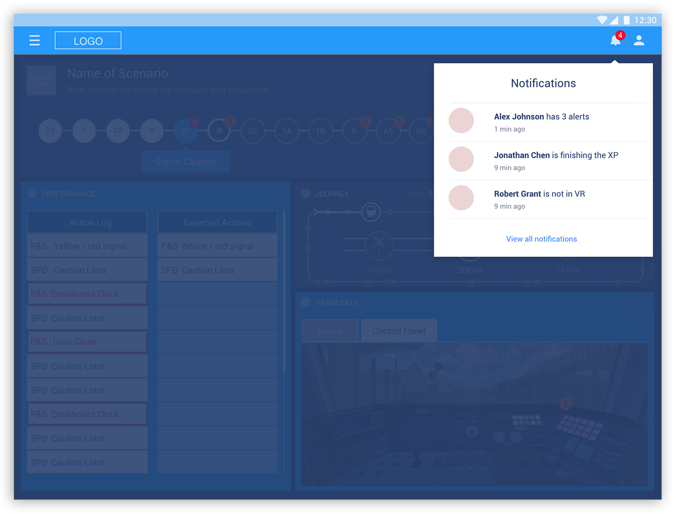
The facilitator will be monitoring a few dashboards at the same time and therefore, the notification feature will be helpful to swap quickly between screens.
Also in each dashboard, a lot of information will be displayed at the same time – performance, journey, train data, etc. – so the challenge here was how to make all information digestible and useful for the facilitator in order to see, analyse, control, and make decisions both effectively and in a quick manner. To help visualise all information better, there will be an option to maximise/minimise windows.
Some alerts will be displayed (the background will be highlighted to grab user's attention).
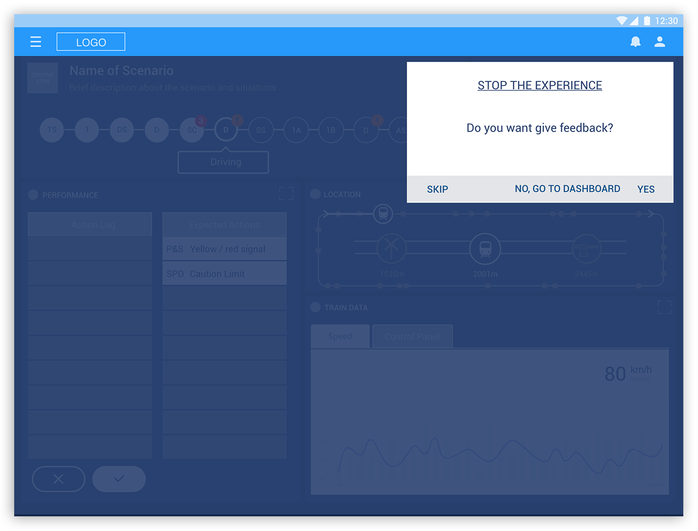
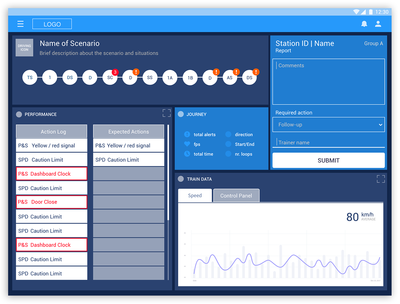
3. Feedback
The feedback will work as a debrief, a combination of what the facilitator judged during the experience, and a conversation with trainees to understand/clarify some points. A checklist will be provided to help and guarantee that everything was considered, and that the unexpected behaviours were discussed. For MVP, a simple version of the feedback will be displayed in some parts of the dashboard screen, after tapping the stop button. The feedback will also be accessible later in the trainees' cards.

UI Mockup
After all features had been defined for the MVP, it was time to work how it would look like. The colours play a vital role because they are also functional. They will alert the user if something goes wrong and differentiate what’s past, current, and future stages. Iconography was also important, it needed to be designed as simple as possible and with a sense of familiarity with user. As an example, I will show only the main screens.
The Take Away
In the beginning, I proposed what could be considered as the ideal scenario with many more features and a more complex user flow. For example, on the feedback section it was designed in a single page with much more content. Also, the facilitator could have the option to give feedback while some alerts of unexpected behaviours where showing in the dashboard. This could allow them to save time and effort in future steps.
Another part that had a lot of changes was the map in the overview page: it was bigger and with too much information in it. For the MVP it was reduced to 3 icons showing the last, current, and future event and the overview of the journey.
The process of simplifying a product was a big learning for me and, a good exercise to understand what's really matter to the user.